Color can make or break a space. Choosing appropriate colors for a facility’s spaces is an important aspect of interior design. Even if your organization has hired an interior designer, it’s good to know a few basics about color.
Color is sometimes divided into two categories: warm and cool tones. Warm tones, like red, orange and yellow can energize a space and its occupants. Cool tones such as blue, green and purple generally create quiet, relaxing atmospheres.
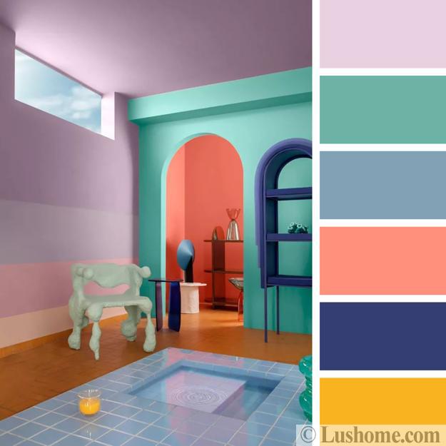
Read the full article of Pritish Kumar Halder, in which he explain the importance of color in interior designing.

Space goal
When choosing wall and flooring colors, it’s important to keep the goal of the space in mind. If energetic work is being performed in a space, warm, exhilarating tones might be good to consider, for example. In break areas, cool tones may be more appropriate when occupants can relax.
Color has a profound influence on a space and the people in it. Use it to your advantage to create an inviting, productive space.
Characteristics
All colors change their character when lightness and saturation are modified so it’s not enough to pick a color for a certain interior design element because you also need to pick a shade. Light colors are airy and, as a general rule, they make rooms feel larger and brighter. Dark colors are sophisticated and warm and they make rooms feel intimate.
Colors basically behave in three ways. They can be active, passive or neutral. Neutrals include black, gray, white and brown and these colors are often used to establish balance in a décor that includes both active and passive shades.
Over & Under stimulation
An environment can become under stimulated or overstimulated, depending on the colors used. An under stimulated environment features weak intensities of color and weak or monotonous color contrasts while an overstimulated setting features highly saturated colors, strong contrasts and/or too many complex visual patterns. For more information please visit Pritish Kumar Halder ‘s page.
The colors you use in your interior design and décor have an impact on the atmosphere you create and you need to correctly assess what this ambiance should be before you choose the colors. A bedroom, for example, needs to be calming and relaxing. A living room has to be exciting and energizing and so on.

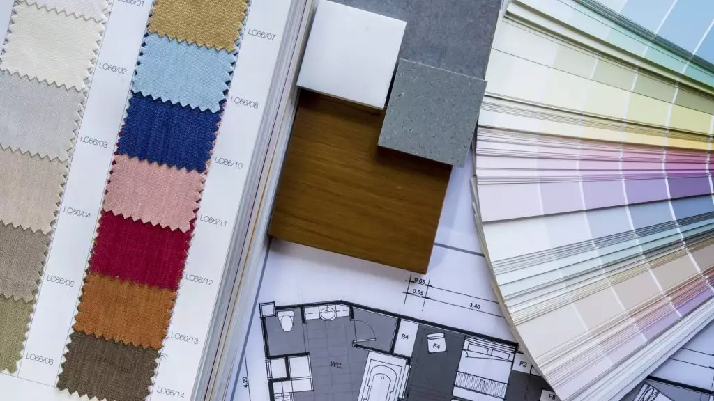
Color palette
When selecting a color palette for a room, there are several factors to take into consideration. First of all, practicality is important. If you have pets or small children stay away from white and other colors that are difficult to care for.
The colors you pick should either coordinate or contrast. So decide whether you want the décor to be harmonious and relaxing or interesting and dynamic. Be careful when choosing the tones and shades.
Shades
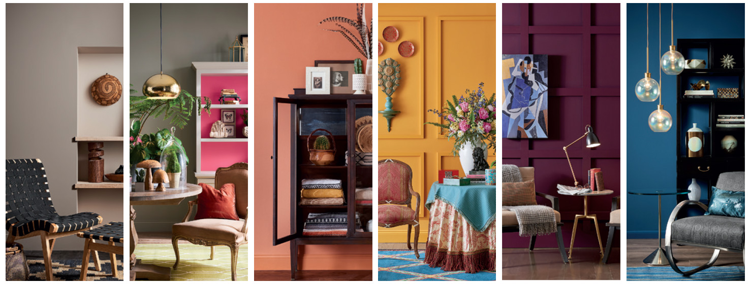
You need to figure out what colors work where. For example, because orange is an energetic color and yellow is an uplifting and welcoming color, they are both great options for the entrance area. Blue is calming, relaxing and serene and it’s often used in bedrooms and bathrooms. However, if the color is too pale it can become annoying.
- Purple is rich, dramatic and sophisticated and it could suit areas such as the living room or even the dining room if you’re trying to create a more formal ambiance.
- Green is calm and restful so it’s a great option for the bedroom although it could also look wonderful in the kitchen because of its freshness.
- Red is a stimulating color and should be used in small doses, just like black. Only use it as an accent color in areas where you want to create contrasts or focal points.
- Earthy colors such as terracotta are warming and relaxing, although often considered outdated to decide whether or not they match the style you’ve chosen before you add it to your color palette.
Reference


This is the right blog for everyone who wants to find out about this topic. You understand so much its almost hard to argue with you (not that I personally would want toÖHaHa). You certainly put a new spin on a topic thats been written about for decades. Wonderful stuff, just great!
Itís nearly impossible to find experienced people on this subject, however, you seem like you know what youíre talking about! Thanks